See four real-world scenarios where DisabilityStatistics.org is used to support proposals, build presentations, and answer data questions in this webinar from The Harkin Institute. Daniel Van Sant, director of disability policy at The Harkin Institute, poses the scenarios to Bill Erickson and Camille Lee from DisabilityStatistics.org. Bill and Camille share their screens to show exactly how to get maps, charts, and data tables from the site.
Pro tips that you’ll pick up include:
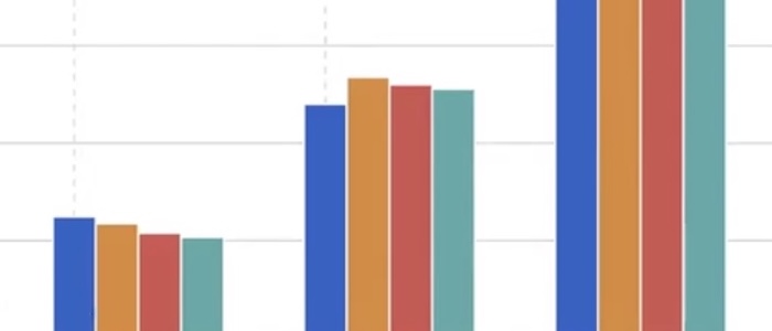
- Showing data from multiple states or counties in a single chart or graph
- Getting a URL to a specific map or chart
- Downloading a chart in JPEG format or a data table in Excel or CSV format
- Changing a chart’s Y axis
In addition, you’ll learn why DisabilityStatistics.org uses the American Community Survey, and how the American Community Survey defines disability. The video also covers why the site offers 5-year and 1-year data and the advantages and disadvantages of each.
The webinar and its transcript are available on The Harkin Institute’s YouTube channel.